Add img/project-safedate.jpg
Add img/project-safedate.jpg
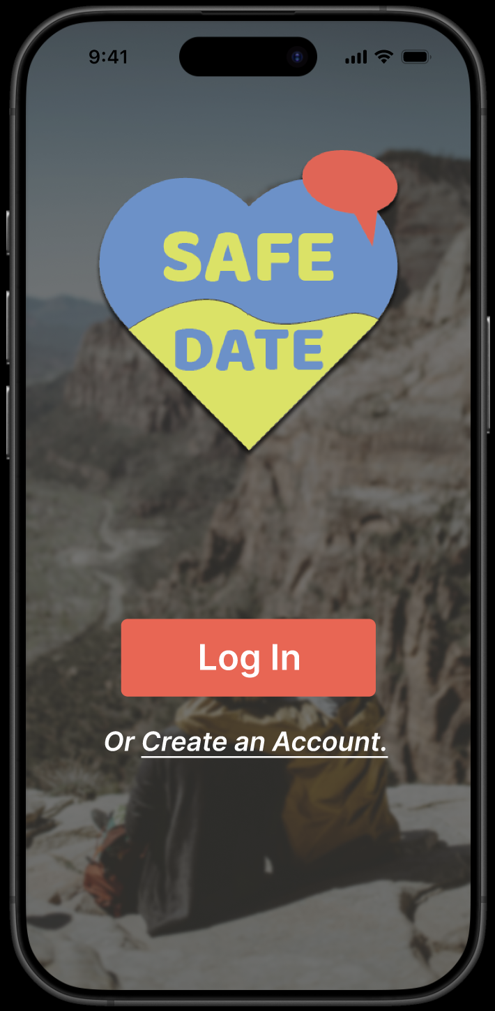
Meeting people from the internet is pretty normal now, but knowing they are who they say they are? That's a different story. SafeDate is a mobile app concept that lets users verify someone before a first meetup, with an SOS alert for emergencies and a premium option for extra peace of mind.
I did the whole UX design process on this one, from user flows and information architecture to high-fidelity screens and a clickable Figma prototype. I also kept track of the safety goals and design decisions along the way.
Researched existing safety apps and talked through user needs.
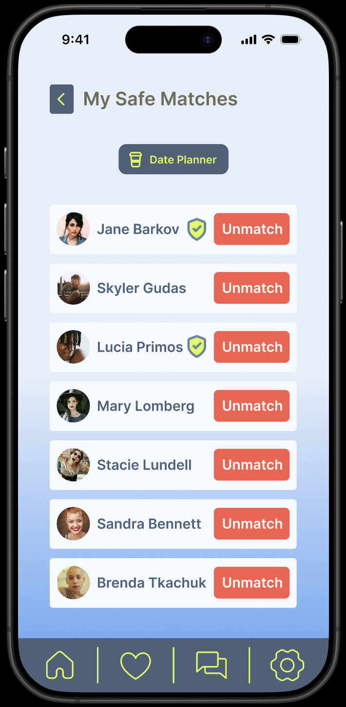
Mapped the core paths: ID verification, SOS, and premium upgrade.
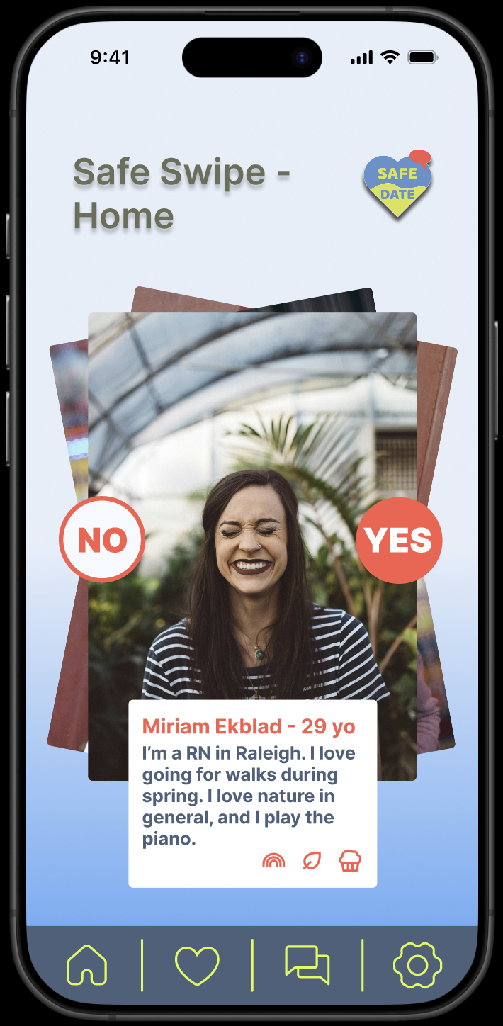
Designed high-fidelity screens with clear hierarchy and accessible UI.
Built a clickable Figma prototype linking all the key screens.
Refined spacing, added a camera permission prompt, improved the chat flow, and simplified the SafeDate planner.
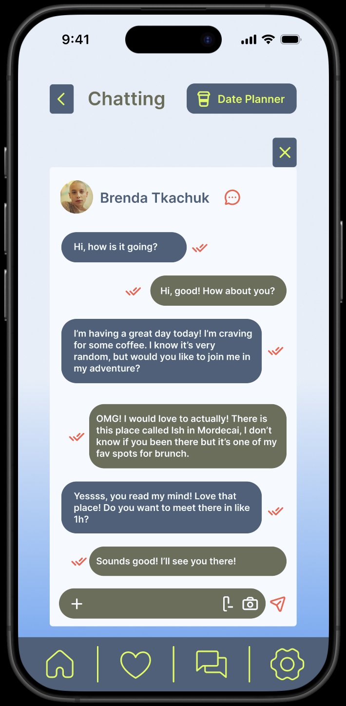
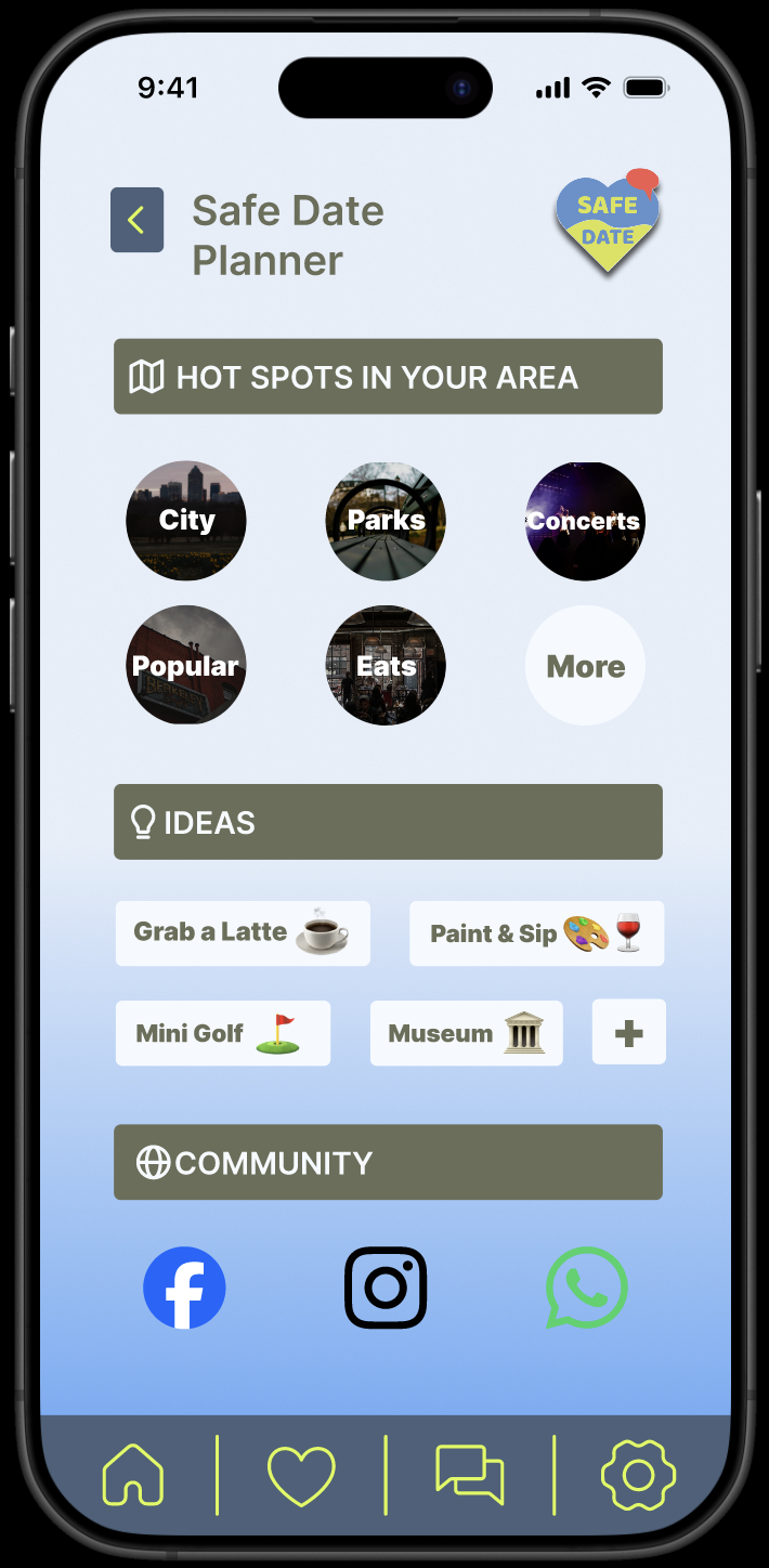
Screenshots from the Figma prototype.
Click through below or open it directly in Figma.
This project really made me think about what it means to design for safety. When someone could actually be in danger, every button and label matters. Accessibility wasn't just a nice-to-have here, it was the whole point.