Add img/project-foodbank.jpg
Add img/project-foodbank.jpg
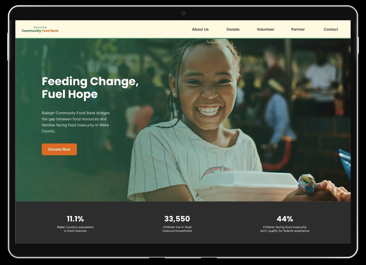
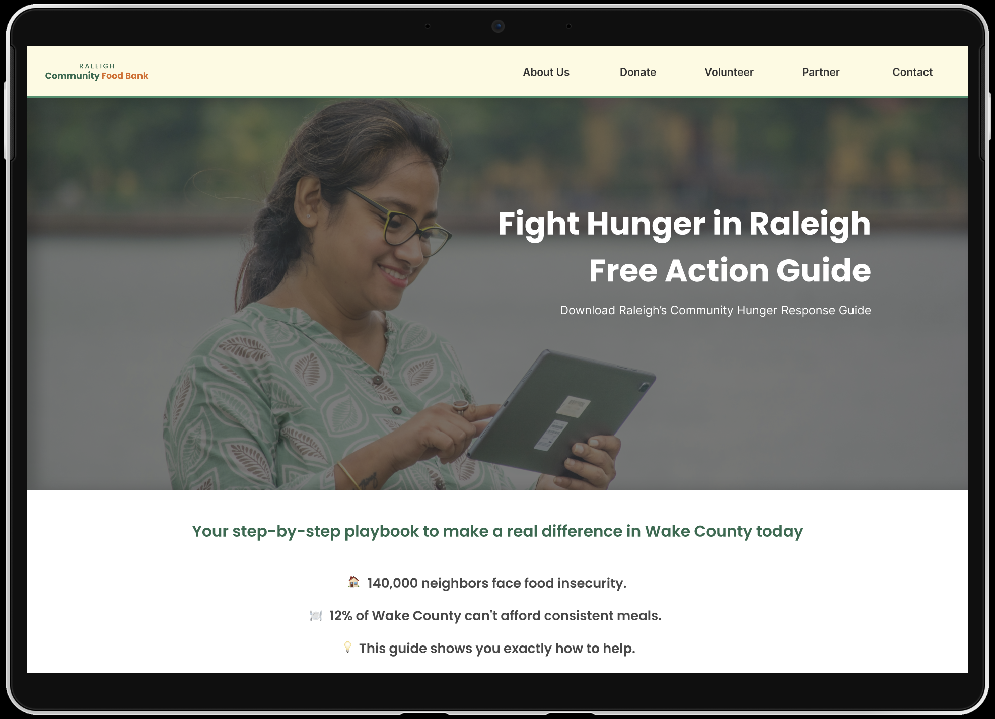
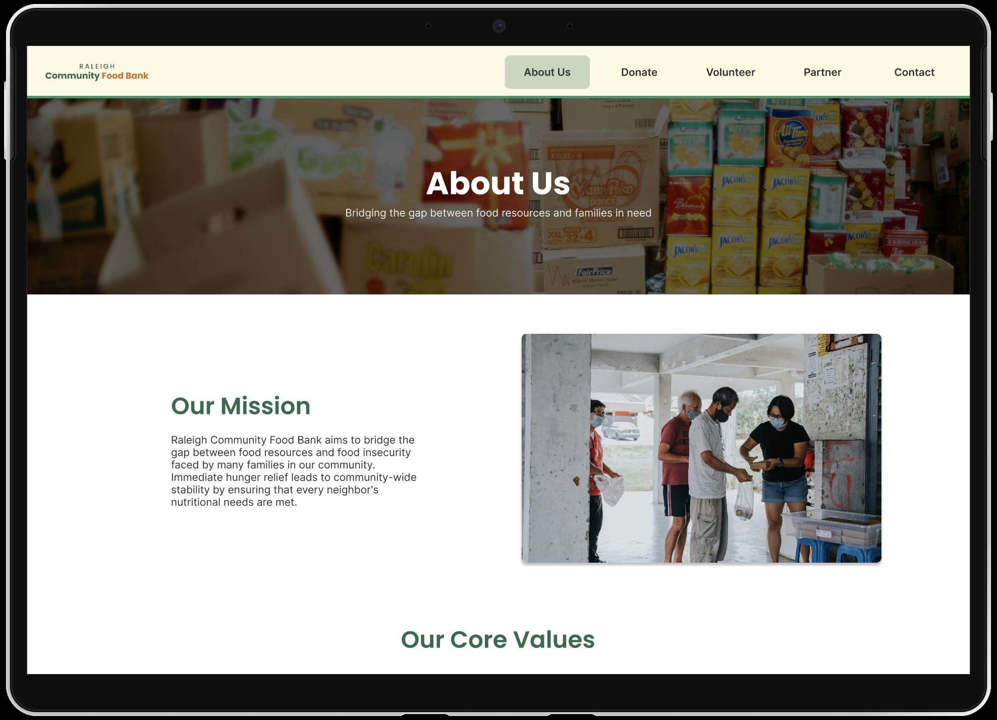
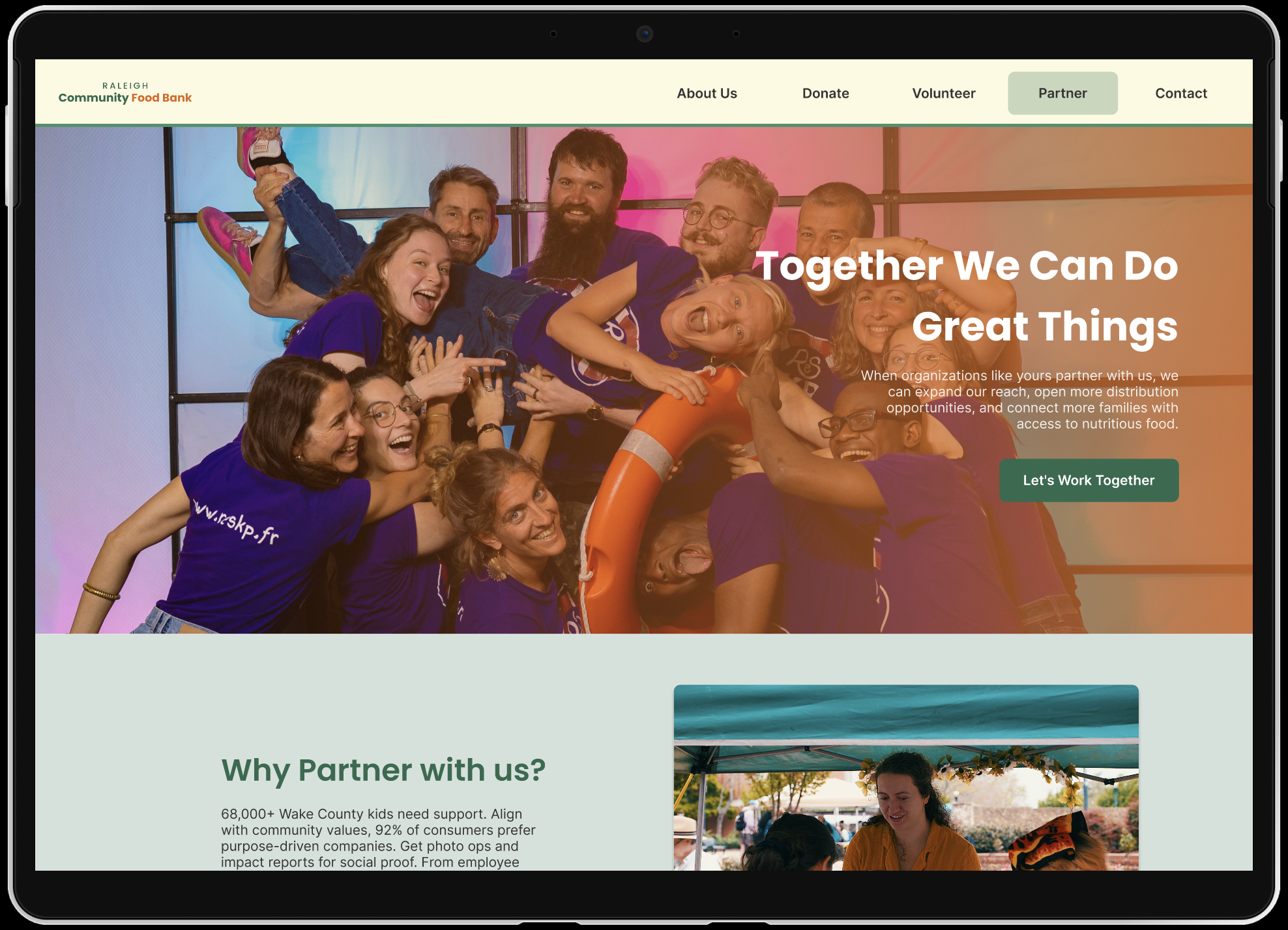
This was a team project for school where we designed a website for a community food bank from scratch. Our goal was to create a clear, accessible experience that makes it easy for people to volunteer, donate, and find the resources they need.
I was the lead designer, responsible for the overall design direction and building all the screens in Figma. Kate Kelly led the user research and Taliya Lewis handled the usability testing and documentation.
User research, competitive analysis, and defining the core problems.
Mid-fidelity wireframes and user flow mapping.
Our tester ran sessions with real users and documented the findings.
High-fidelity screens with accessible color and clear hierarchy.
Put together a full write-up of the process, what we learned, and the decisions we made.
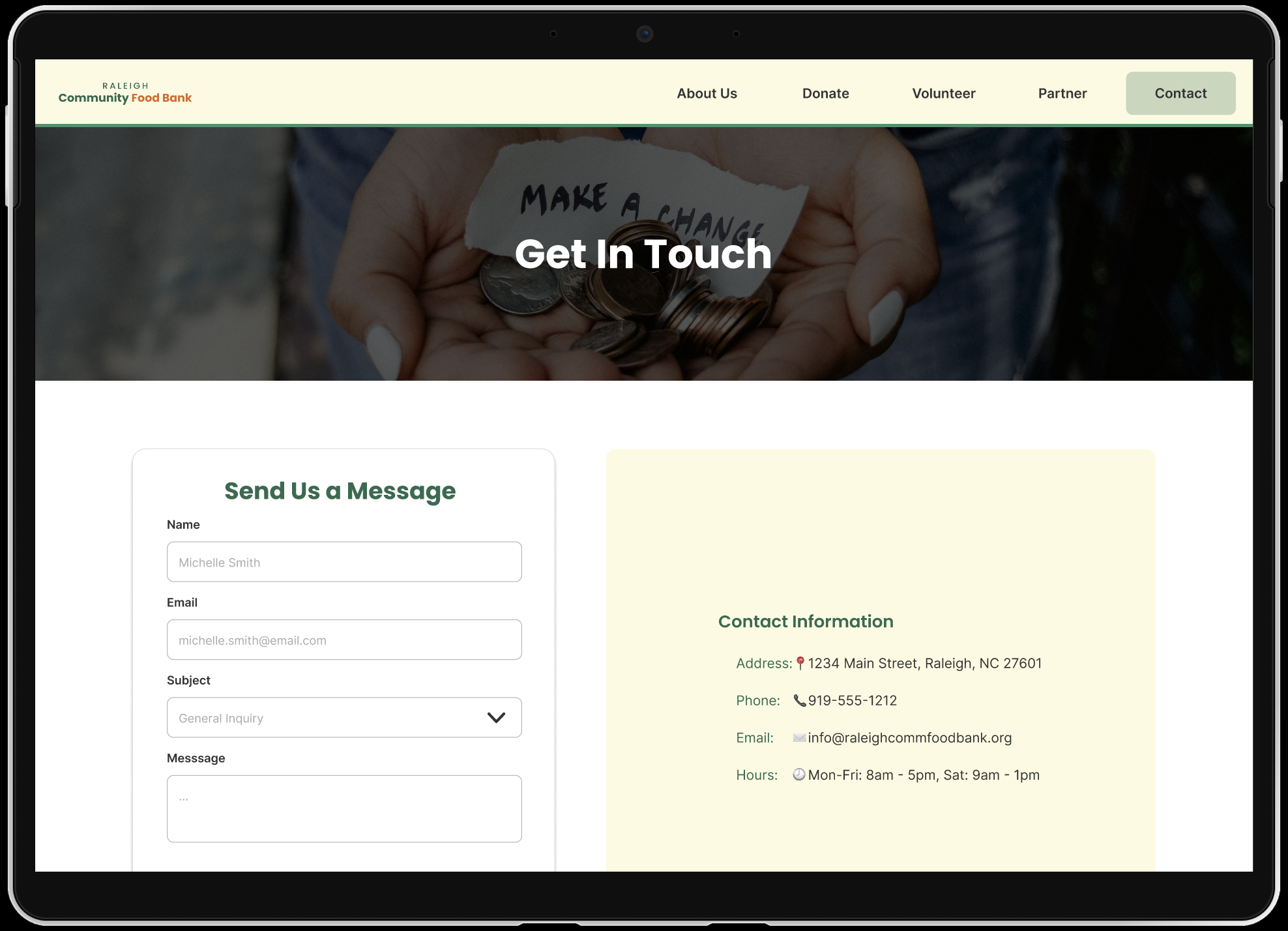
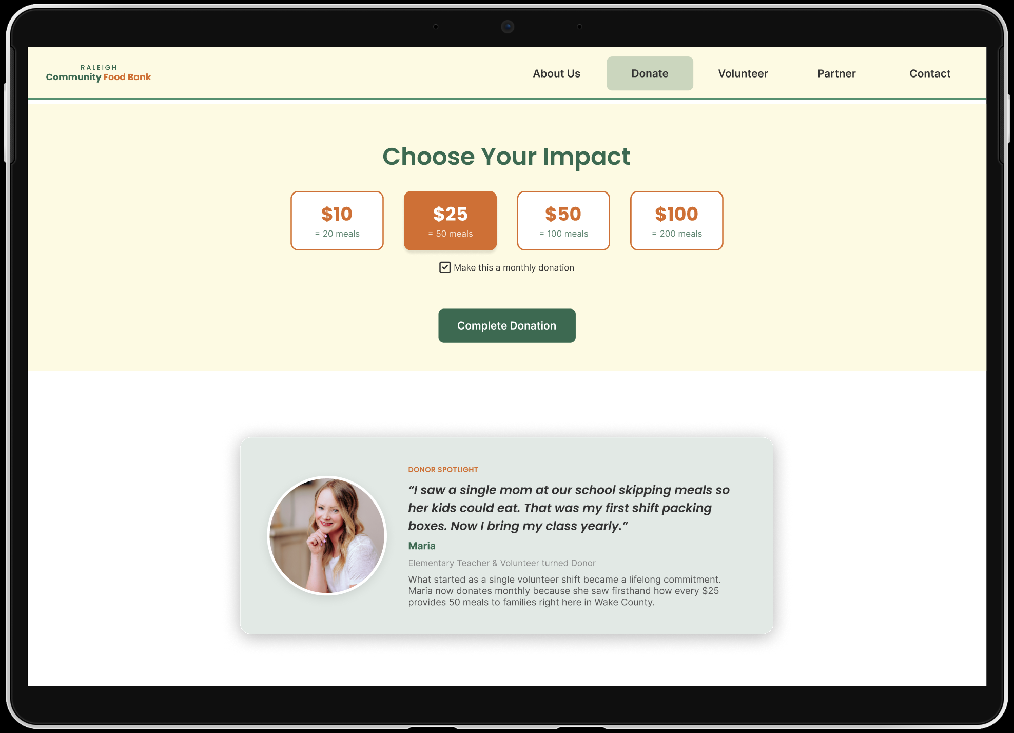
Screenshots from the Figma prototype.
Click through below or open it directly in Figma.
Collaborating with a team made this project stand out for me. Learning to take research findings and test results from my teammates and turn them into better design decisions was really valuable. It also made me more intentional about designing for people who might already be stressed, where clarity and simplicity really matter.